Monday, 12 April 2010
Message from Ms Prince
Sunday, 11 April 2010

Friday, 9 April 2010

Thursday, 8 April 2010
+clean.jpg)
Wednesday, 7 April 2010
+clean.jpg)
Tuesday, 6 April 2010


Monday, 5 April 2010
Evaluation Part (i)


What ways does your media product use, develop or challenge forms and conventions of real media products?
My media product is a music magazine of the Hip-Hop genre. Both of these concepts determined the actual appearance of my magazine. For example, in the Hip-Hop industry, the theme of “bling” is commonly featured, also most hip hop artists are wearing a New Era Cap - this gave me the incentive to have my artist featured on the front cover, wearing a New Era Cap, so my audience could see evident comparisons between other professional Hip-Hop magazines and my magazine. Throughout my magazine my colour-scheme consisted of four main colours; white, black, blue and red. I chose to use these particular colours as I wanted to intertwine three dark colours with a light contrasted colour of the background to create a sense of diversity to highlight the mainstream readership of the magazine. All of the fonts are typical of a Hip-Hop magazine as they are in bold and stand out on the page which attracts the reader to the specified article. All of my images are Medium close-ups (which is a common convention of Hip-Hop magazines), except for the images featured on the contents page which are a variation of medium-long-shot and medium close-ups. I decided to use a medium-long-shot for the contents page because I wanted to draw attention to my artists outfit and how it fit into the Hip-Hop convention. Many colloquialisms are utilised in my feature article which also is another principle of Hip-Hop magazines. For instance, I used words and phrases such that relate to the Hip Hop industry like “you get what I’m saying” etc.
Evaluation Part (ii)
How does your media product represent particular social groups?
My media magazine represents particular social groups through text, and as I used colloquialisms. Also, the whole idea/concept of Grime/Hip-Hop music is ‘Giving something back to the community, trying to encourage young people to move away from crime, sex, drugs…’ This is why many young people seek hope and inspiration through such artists.
Evaluation Part (iii)
What kind of media institution might distribute your media product band why?
The distribution of my magazine is totally based on the genre and as my magazine is a Hip-Hop magazine, there is not really a broad market that will be content in distributing my magazine. I believe this as Hip-Hop itself is constantly under scrutiny and is deemed as materialistic as well as hated. However my magazine promotes a sense of fun, and passion towards music therefore, I feel that institutions like urban music channels e.g. MTV Base and Channel U, music stores e.g. HMV, newsagents and urban clothes stores will be contented to distribute my magazine. Also, my magazine focuses on the change of Hip Hop to a more communal form of life. This is why I believe it will be more successful than others.
Evaluation Part (iv)
The target audience of my magazine is males and females aged 15-24. I wanted a unisex audience as I featured both male and female dominated articles on my contents page such as subjects on relationships, fashion, as well as interviews from rap artists. Also, the colour scheme and layout of the magazine was quite male dominant and there was only one image of a female artist included. The age of my target audience is quite mature as real-life topics like sex, drugs, gun/knife crime… which my target audience may be able to relate to. I also wanted to aim my magazine at those less-fortunate and make it enjoyable yet affordable for them. Additionally, I carried out a survey and the majority of my readers were of the above age group.
Evaluation Part (v)
How did you attract/address your audience?
I attracted and addressed my audience through my bright colours and the use of my vivid images. As all of my Mastheads were in red font - immediately attracting the readers’ attention. Also, my structure was clear and the text was comprehendible as I spaced my text out on the page and used a black font behind a light background, lest any of my readers’ were visually-impaired. A Bauhaus93 font was used for all of the Mastheads and sub headings whereas Times New Roman was used for the main text to create logic for the audience. In addition, I made sure that my images (especially my front cover image) were bright and eye-capturing so when people so the magazine, they would be enticed to read it from its appearance.
Evaluation Part (vi)
1. Photoshop
a. Image Manipulation
i. Cropping
ii. Light effects
iii. Magic wand
iv. Magnetic cropping
v. Shading
vi. Special effects
b. Text manipulation
i. Test Wrap
ii. Installation of Alien Fonts
iii. Glow
iv. Outline
v. Shading
c. Generally
i. Photoshop operation in general.
2. BlogSpot
a. Creation of Blogs
b. Maintenance of Blogs
c. Permission Setting Of Blogs
d. External Tools Application On Blogs:
i. Slideshare.net etc
Questionnaire
As part of my AS Media Studies coursework, I am required to produce a questionnaire to help me to identify my target audience. Through the use of this questionnaire, I can identify which age group will be attracted by my music magazine, and what they would expect from the magazines as readers. I would really appreciate it you could spend a few minutes to fill the questionnaire. Thank you.
1. What is your gender?
Male
Female
2. How old are you?
11-14
15-19
20+
3. What is your ethnic background?
_____________________
4. What music genres do you usually listen to?
R&B
Hip Hop
Rap
Rock
Grime
Other_____________________
5. Who are your favourite artists?
____________________________
6. How often do you attend concerts/gigs?
Weekly
Monthly
Yearly
Never
7. If your answer was any of the above except never for question 6, then which artists or bands did you go to see?
_________________________________
8. Which music channels do you like to watch?
___________________________________
9. Do you spend time on the internet on music websites or websites regarding music? If yes, please specify how many hours.
______________________________________
10. If your answer was yes to question 9, what types of music do the websites consist of?
___________________________________________
11. What are your hobbies?
Raving
Dancing
Singing
Other__________________
12. How much are you willing to spend on a music magazine?
2.50
3.50
4.50
13. Do you purchase music magazines? If so, which ones?
_______________________________
14. What do you like to see in a music magazine
______________________________________
15. What do you like free with your magazine?
_________________________________________
16. Do you participate in the competitions the magazine offers?
Yes
No
Thankyou!
Evaluation Part (vii)
Thursday, 1 April 2010
Tuesday, 30 March 2010

Wednesday, 24 March 2010


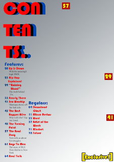
Front Page Sketch (iii)
 This is my first attempt i had at sketching my front cover for my magazine. I was quite unsure what i would have in my magazine at that time but the thoughts and ideas developed as time went along.

Front Page Sketch (i)
 This is the last attempt i had at the sketch of my front cover for my magazine.
Analysis of Drummer Contents Page
 This is the analysis of drummer contents page we done in media class.
Friday, 19 March 2010
Analysis of Kerrang contents page

Analysis of Vibe Contents page.

Wednesday, 17 March 2010


Conventions of a Music Magazine Cover

Monday, 15 March 2010
Textual Analysis Of XXL Front Cover.

The magazine cover that I will be analysing is the XXL front cover of Lil’ Wayne and Baby. This magazine cover is constructed perfectly to suit the audiences it is aimed at. A lot of different presentational devices were used in the formation of the front cover, I will be going through some of them and analysing how they attract the target audience.
The first glance at the front cover reveals the main image of Lil’ Wayne and Baby to be the most dominating factor on the front page. The main image is of the two rappers Baby and Lil’ Wayne, both rappers containing a lot of tattoos on their bodies, and are also wearing a lot of jewellery. The tattoos can connote a lot of things from toughness to fame and wealth. The jewellery is another wealth connoting feature but they are also used as Lil’ Wayne advertising his record label (Young Money). Also, the topless nature of both men could be used as an attractive feature to girls in the age range of the target audience. Through the main image alone, we can see just how many attractive techniques are used to attract various readers.
The masthead of the magazine, although pushed to the side by all the other features, is still really dominant. The red background on the diamond encrusted XXL is much more attractive to the Hip-hop audience than expected and it once again connotes wealth. Diamond is basically wealth and the red background could refer to a red carpet rolled out for royalty. Therefore, it backs up the main image and again, is really attractive for the target audience of the XXL magazine.
The cover lines are another feature which stands out and ties the whole magazine together. The “&” in “Baby & Lil Wayne” is red and a different font is used to show the uniqueness of the two artists. The red also matches the masthead and goes along nicely. The phrase “survival of the fittest” is also really great on the page and makes you want to read it, therefore a form of attracting the audience.
In conclusion, I think the front cover is really successful in targeting and attracting its target audience. Although the front cover is a norm in the hip-hop magazine world, I believe that it should be a bit simpler, but for XXL, it is a convention.