Tuesday, 30 March 2010

Wednesday, 24 March 2010


Front Page Sketch (iii)
 This is my first attempt i had at sketching my front cover for my magazine. I was quite unsure what i would have in my magazine at that time but the thoughts and ideas developed as time went along.

Front Page Sketch (i)
 This is the last attempt i had at the sketch of my front cover for my magazine.
Analysis of Drummer Contents Page
 This is the analysis of drummer contents page we done in media class.
Friday, 19 March 2010
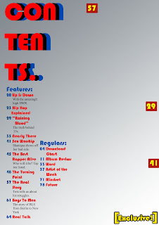
Analysis of Kerrang contents page

I will be analysing the contents page for the Kerrang magazine. The main image on the left is of a typical rock star. His body is covered with tattoos. He has a rugged beard and he is posing as typical rock star would. The background behind the image is plain black. This is effective as it will attract the audience of a typical rock audience. The font used for the page numbers is a small yellow font. An advertisement is placed on the bottom right of the page. The other images around the main image are also images of rock stars, and there are images of live performances of rock star performers. This helps to add realism to the magazine and makes it look more realistic and authentic. At the top of the page there is an editorial with a message from the editor, which helps to make it more authentic. The title of the page ‘contents’ is written in a yellow font, which contrasts the black background which helps it to stand out. Beneath this are quotes from the featured artists. There is also a section called "Features" which contains their unique selling points about major artists featured in the magazine.
Analysis of Vibe Contents page.

The vibe contest page featuring Clara can be classified as a convention for R&B and Hip Hop magazines. The Most attractive thing at the first glance is the picture of Ciara lying on the floor with her feet held high. The semi-nudity of the famous artists could be found as a very attractive thing for most of their target audiences. The background as always is plain and simple, this one creating the image of a photo shoot. The background gets black at the top where there is less need of attention and as Ciara comes on top, the background turns white, indicating importance. The “V” from the Vibe is incorporated into the contents page to sit nicely but not enough to distract you from the important features. The page is labelled contents but is done in a unique way, which is then a convention through every vibe contents page. Under the contents sign, there is the features that relate to the image or are surrounded by some relation of the artist. Vibe is unique with their contents page, because there are three different contents page and the contents page also incorporates fashion, by describing the clothes worn by the featuring artist and their price.
Wednesday, 17 March 2010


Conventions of a Music Magazine Cover
Main Image- usually a musical artist which takes up most of the magazine cover. There is usually something original about the main image such as the way the band are standing, sitting or what they are doing.
Masthead- depends on the genre of the magazine but is usually located on the top left or stretched to cover the entire top of the magazine cover.
Cover lines- there are usually many cover lines on a magazine cover.
Main Cover line- is usually supported by a subtitle to describe the main feature, these are usually in different font size and colour.
Colour- on most music magazine covers there is a colour scheme usually consisting of 3 or 4 colours, the most common colour scheme is red, black and white.
Selling Line- music magazines often have a selling line usually giving us a little more information than the masthead does, it often says something which will make the audience want to buy the magazine.
Website- the website of the institution which publishes the magazine is usually displayed on the magazine cover.
Price- the price is usually included.
Dateline- month or week which the magazine is published for.
Barcode- a standard barcode so the magazine can be sold by retailers.

Monday, 15 March 2010
Textual Analysis Of XXL Front Cover.

The magazine cover that I will be analysing is the XXL front cover of Lil’ Wayne and Baby. This magazine cover is constructed perfectly to suit the audiences it is aimed at. A lot of different presentational devices were used in the formation of the front cover, I will be going through some of them and analysing how they attract the target audience.
The first glance at the front cover reveals the main image of Lil’ Wayne and Baby to be the most dominating factor on the front page. The main image is of the two rappers Baby and Lil’ Wayne, both rappers containing a lot of tattoos on their bodies, and are also wearing a lot of jewellery. The tattoos can connote a lot of things from toughness to fame and wealth. The jewellery is another wealth connoting feature but they are also used as Lil’ Wayne advertising his record label (Young Money). Also, the topless nature of both men could be used as an attractive feature to girls in the age range of the target audience. Through the main image alone, we can see just how many attractive techniques are used to attract various readers.
The masthead of the magazine, although pushed to the side by all the other features, is still really dominant. The red background on the diamond encrusted XXL is much more attractive to the Hip-hop audience than expected and it once again connotes wealth. Diamond is basically wealth and the red background could refer to a red carpet rolled out for royalty. Therefore, it backs up the main image and again, is really attractive for the target audience of the XXL magazine.
The cover lines are another feature which stands out and ties the whole magazine together. The “&” in “Baby & Lil Wayne” is red and a different font is used to show the uniqueness of the two artists. The red also matches the masthead and goes along nicely. The phrase “survival of the fittest” is also really great on the page and makes you want to read it, therefore a form of attracting the audience.
In conclusion, I think the front cover is really successful in targeting and attracting its target audience. Although the front cover is a norm in the hip-hop magazine world, I believe that it should be a bit simpler, but for XXL, it is a convention.
Wednesday, 10 March 2010
Music Magazine Planning.
Style, foreground and background typography;
· Clear white/off white background.
· Clear block capitals for the masthead contrasting with the background.
· Masthead is behind the artist/group’s picture.
· Big coverlines on the left side of the page.
· Smaller ones on the right
· The font should be contrasting against the background
· An important cover line could possibly be on the top of the page, above the title.
· Small date in the bottom left corner.
· The barcode in an insignificant place on the page
· Website address?
· Make it attracitve using the cover lines , the foreground and the background.
Genre;
· R&B
· Rap
· Hip Hop
Target Audience;
· 14 – 25 year olds
· My audience would be generally interested in channels like MTV etc.
· Either in school, college or uni.
Generic conventions of chosen music mag genre;
· Free Gig and Festival Tickets
· Free Downloads or Cd's
· Free Posters or T-shirts
· Free Headphones
Subscribe to:
Comments (Atom)